Quench, the TRWA Trade Magazine
When you inherit a trade magazine, the learning curve is steep. There’s industry lingo to learn, articles to be fact-checked and edited (which takes twice as long while you’re catching up on the facts), and on top of it all — there’s a magazine to be redesigned.
Some basics I decided to stick with on Quench were keeping basically the same structure to the magazine and instead focusing on updating fonts, images and layout. We have an older audience, so font sizes have to stay pretty big and readable. Graphics have to make sense in the context of the story — and as the sole designer on the project, they have to be mostly pre-made and available for commercial use. At TRWA we use Freepik as our service for graphics and images. I would definitely suggest it to other magazine editors.
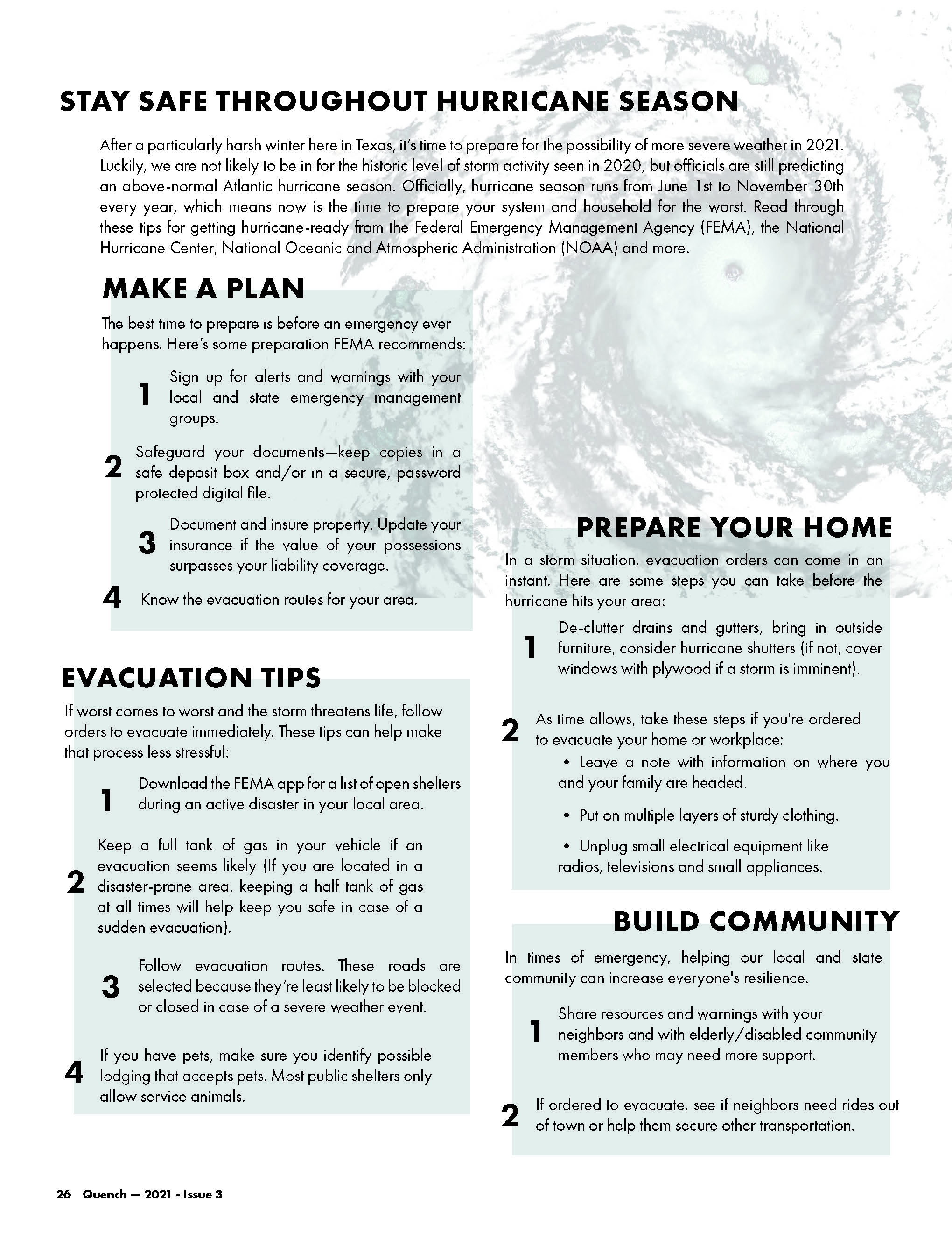
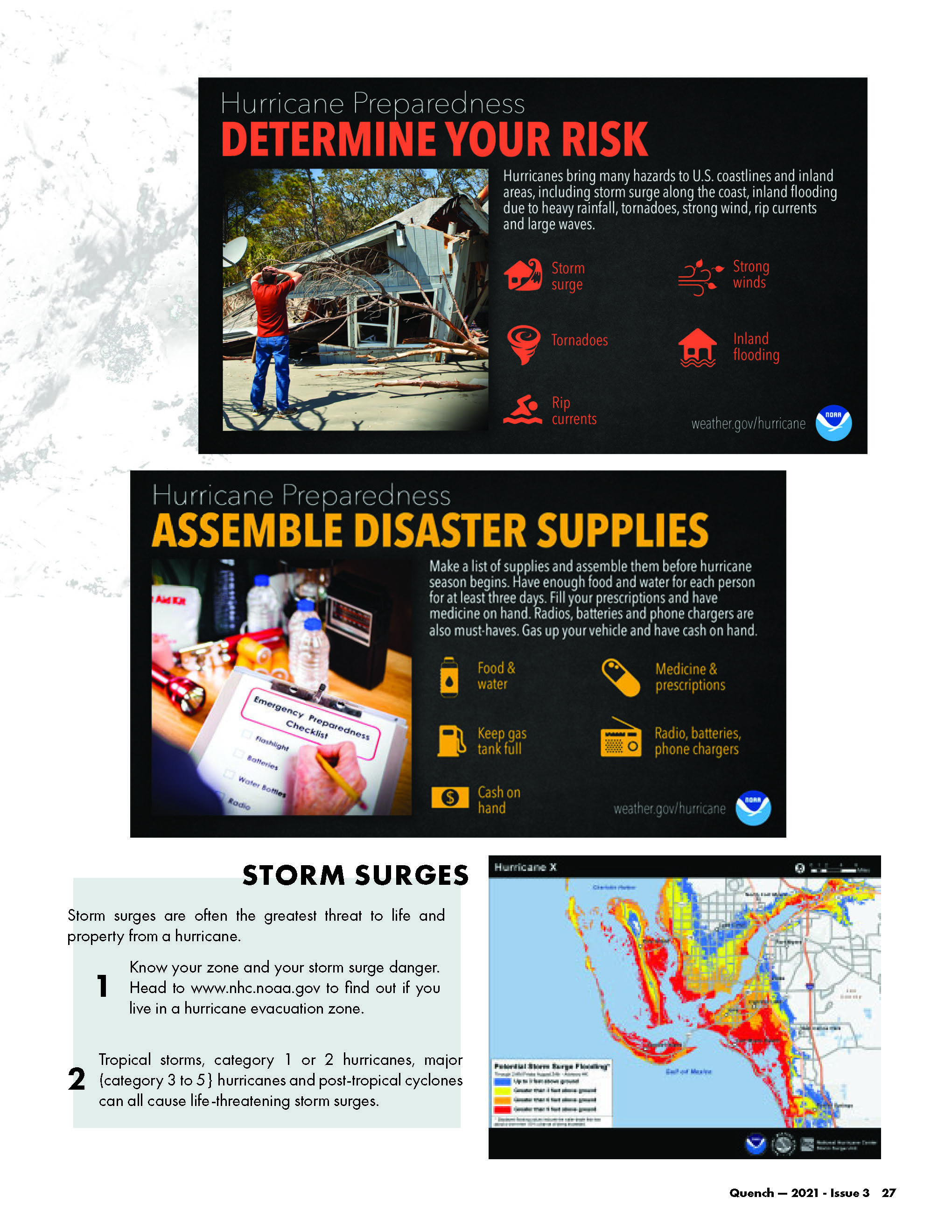
I wrote the copy for, as well as designed the two page spread above. You’ll notice that the black box graphics here are National Oceanic Atmospheric Administration (NOAA)-made. Their images are free to use and they want them to be circulated far and wide. I decided to stick with their prebuilt graphic blocks to get across some great information. I’d already written all the copy on the rest of the page, so finding some relevant, high quality copy in those graphics was another bonus. The free-form of the hurricane (which I downloaded from Freepik, then colorized in Photoshop), helps to make this page visually interesting as well as topical. What could’ve been a boring listical comes alive with color and depth.
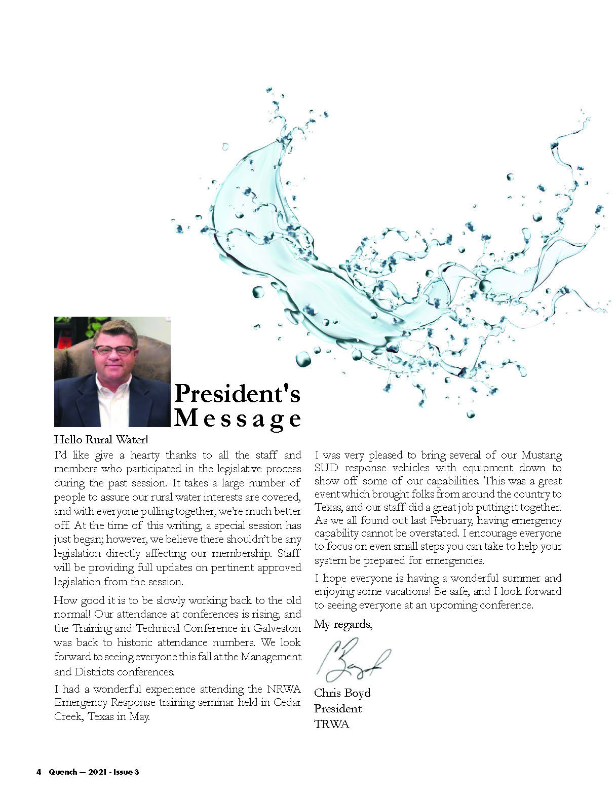
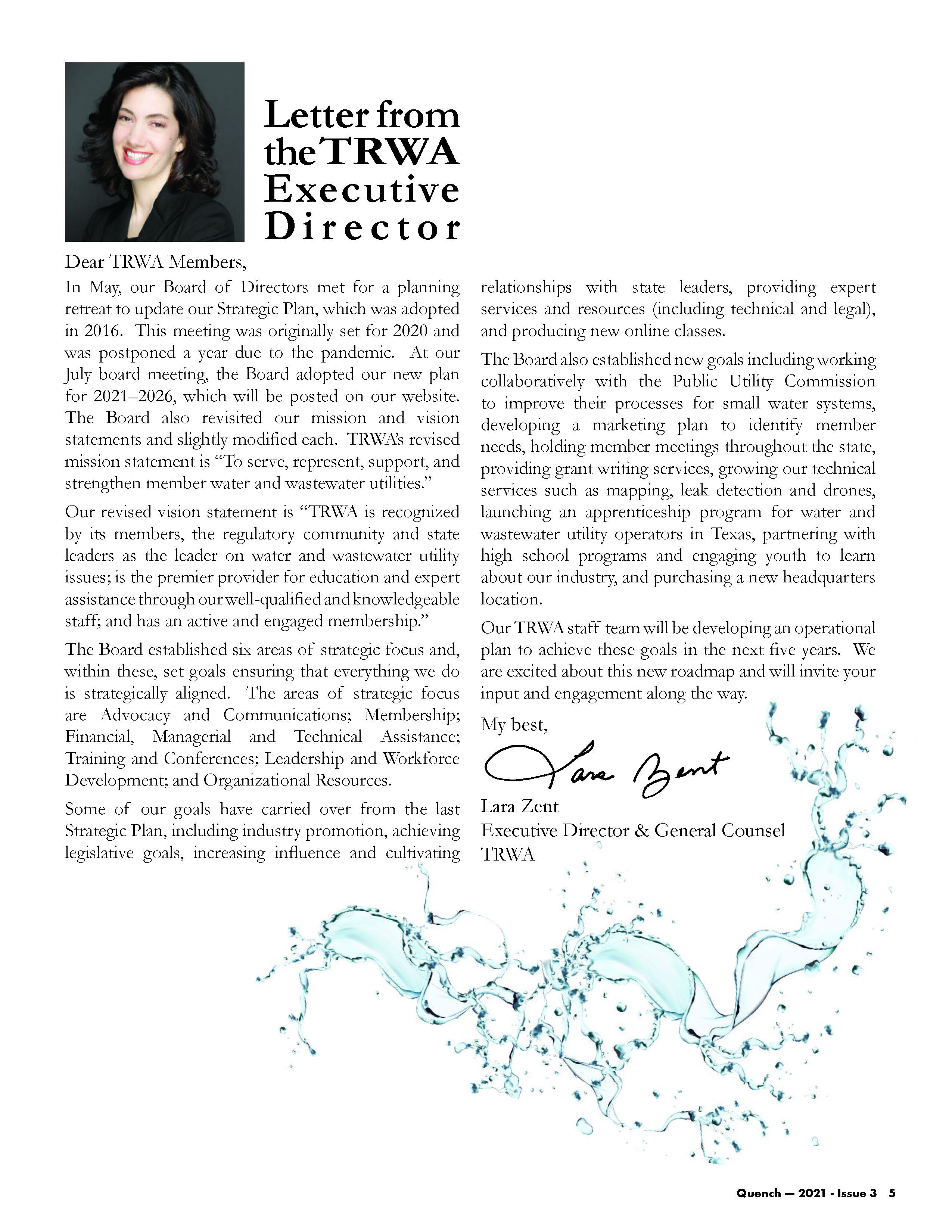
The work I’m most proud of in these issues are simple pages like our President’s Message and the Letter from the TRWA Executive Director. These are included in every issue, and don’t lend themselves to any sort of graphics or visually interesting look. I decided to make the spreads typography driven and have a splash of our water influence. The main audience for our trade magazine are our rural water and wastewater members and they read Quench cover to cover. Making these recurring spreads into something I love visually was an important baseline for me.

Another important aspect of designing Quench came in elevating the way we frame our technical articles. These are written by a rotating list of instructors and Financial, Managerial and Tehnical experts in the rural water industry. Previously, the content didn’t have a polished look and included pictures of the instructors at the top of the article. There was really no visual indicator of what the article was about. I realized this specific industry content is maybe the most valuable for our members, and could be information they’re not getting anywhere else (once I did enough research to understand it all). As an avid reader of magazines like Wired and Popular Mechanics, I decided to use those design influences on our technical works to reflect their subject matter.

As a magazine nerd, getting to design an entire 32-page publication was one of my favorite projects in my career. Trade magazines have a reputation for being a decade or so behind the most popular publications, but as the art director I decided the conventions of trade design don’t have to dictate what I want my content to look like. My focus in this issue was readability, standardization of text and a TRWA “look,” and a focus on really great content that our readers would love. We’ve received a ton of great feedback in return.
Want to see a sample of Quench in person? I’ll mail it to you for free. Request a copy through the contact page on this site.
