Grabbing people’s attention on a screen means standing out from the competition.
Whether it’s eNewsletters, eBlasts for conferences, driving traffic through social media posts or just reaching out to engaged members, the volume of traffic in people’s feeds and inboxes demands you stand out. When I’m crafting content meant to be sent out on our online channels, I’m thinking about what makes someone open or view that particular type of post.
People’s inboxes are the best places to increase registrations for events and engagements for the site. Anyone who opens an email is in a position to go straight to our landing pages and convert to a sale for one of our publications or one of our event registrations because they’re online.
So, how do I encourage people to choose the TRWA newsletter as something they want to open every week?
- Keep the content relevant.
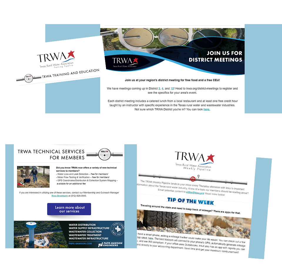
Sponsored content isn’t a great fit for our newsletter because we want members to open with the confidence that they’re being informed, not sold to. We stick with a quick Tip of the Week and relevant industry-related news. - Be a source for free resources.
We include links to free trainings being held by the USDA, the EPA and TCEQ because we know that’s a value ad to our members. If we can get them to go through us to find that information, we’re increasing our standing as an industry leader. - Design with your audience in mind.
As much as I would love to go to an image-only or design-heavy eNewsletter for aesthetic purposes, I understand that the majority of our members are using Outlook. This means that many aren’t going to take the time to download images. Balancing text and images is a crucial part of newsletter delivery for our audiences.
Another design change I made to TRWA’s Newsletters was to add in section headings and breaks. Instead of reading like a word document, I wanted the newsletters to feel like an ePublication. Even though the section headers are images, in the future we’ll be changing custom CSS to keep those headers in without image download.

What has two buttons and increased enrollment for our webinar by 150%? The email above.
The afternoon before a webinar we had 27 registrants (not great for the amount of work that went into organizing this event). So I decided to emphasize the solutions we had for two pain points. One: the whole webinar was free. So I crafted a subject: Have you signed up for your free TCEQ credits yet? Two: attendees didn’t have to attend a full two days to earn credit. So we broke out our full schedule and let people know they’d get credit for any sessions they’d be able to attend.
After sending this out at 3:00 PM, we ended up getting an additional 50 registrants in two hours. When you understand what your customers/audience really wants, the messages you choose can be impactful.
